Every fall, paint brand Benjamin Moore makes a splash with its annual Color of the Year event, drawing out the mystery before dropping its chosen hue, which serves as a prediction for trends in the coming year, writes Hadley Keller in House Beautiful.
The ultimate color chosen by Benjamin Moore for 2021, Aegean Teal 2136-40, takes into account many factors.
“It has a really beautiful blend of blue and green with a touch of gray that gives a softened elegance that’s very inviting,” says Andrea Magno, director of color marketing and development at Benjamin Moore. This year, she notes, “we really looked to the home” for inspiration. Though the color was selected prior to the coronavirus pandemic and ensuing stay-at-home orders, it proved apt: “We started taking a critical look at the modern home two years ago, and that examination only deepened this year, as the home truly grew to become the center of our lives,” Magno tells House Beautiful. “As the events of 2020 unfolded, we felt strongly that Aegean Teal continued to resonate in the home, possibly more so as the importance and expectations of the home reached new levels.”
The color’s multi-functionality was also a key factor, said the Benjamin Moore team. Aegean Teal can read blue, green, or gray — and it works anywhere from the kitchen to the living room, an appropriate consideration at a time when different parts of our homes are serving more purposes than ever.
Finally, the hue’s tie to nature is key. Organic colors tend to ground and calm us, both things we could use a little bit more of right now.
With that in mind, you can spice up your space, or make it warmer and more comforting by pairing a number of these trendy hues with furniture, antiques, wall art, rugs, pillows and lighting fixtures to create texture and drama or comfort and warmth, it’s up to you!
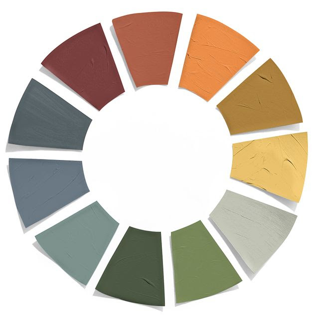
In addition to Aegean Teal, Benjamin Moore also released its The Color Trends 2021 Palette, which can be found HERE.
Here are 15 more color ideas (and another 10 to consider by clicking on the link below) from hgtv.com.
Mulberry
Welcome the warm tones of fall in a space brimming with saturated mulberry. The plummy purple makes a bold statement on the walls of a home office while also extending underfoot on a patterned area rug.
Classic Blue
Classic Blue was Pantone’s 2020 Color of the Year. The bold hue brings a sense of peace and restfulness to the space — quintessential characteristics for a tranquil, autumnal vibe.
Desert Orange
The burnt orange tones feel equal parts intimate and warm against a crisp white walls in a small bedroom with a rug with desert hues.
Ocean
An open and airy dining space can be brought to life thanks to distressed wallpaper in a stunning shade of blue-green. A simple wood table and chairs can continue the warmth while a bubble glass chandelier can add ethereal lighting without detracting from the backdrop.
Deep Coral
Walking the line just between orange and red, this coral color is evocative of an autumn landscape. The tone pairs perfectly with soft greens and pops of gold surrounding it.
Dark Neutrals
Cozy like a cup of coffee, handsome hues of deep gray-brown, sand, charcoal and black fill a dining room with rich color.
Botanical Greens
As the fall leaves fade outside, evoke a feeling of nature inside the house with hues of botanical greens. The eye-catching foliage design of a removable wallpaper will easily transform any room into a peaceful rainforest retreat.
Almond
Sophisticated, soft and chic — this subtle off-white shade is no longer reserved just for the winter months.
Navy and Deep Red
A deep blue sofa paired with a rose-red armchair and accent pillows can create a striking combination. The color scheme can continue on a wall with dramatic floral wallpaper and navy-painted ceiling.
Cognac Brown
Cognac is the design equivalent of a cozy blanket. Just a splash of this brown hue on leather sofas can lend warmth and ease against bright white walls surrounding them in a midcentury modern living room.
Ultramarine Green
Tinged with just a hint of blue, this verdant green has an almost nocturnal feel to it (which, of course, makes it perfect for a bedroom).
Amberglow
Feel like you’re wrapped in a warm throw each time you step into your bedroom with walls painted an autumnal orange-copper hue. Style the space with more shades you’ll spot on a fall landscape — think deep reds, yellows and gray-browns — for a can’t-miss seasonal update.
Mauve and Blue
Playful yet sophisticated, mauve and classic blue are ready for snuggle season in a texture-filled living room. The shades can be carried throughout the space on the furniture, throw pillows and even on an eye-catching tapestry above the couch. Showcasing the colors in multiple ways adds an extra punch of personality and continuity.
Black on Black
Cooler weather means cozier design opportunities. And what better way to feel cozy than on an inviting sectional overflowing with plush pillows and warm throw blankets encompassed by rich, inky black walls. The handsome hue can be continued onto the ceiling for a dramatic look in the space.
Peach
Peach for fall? 100% yes. The warm undertones of this pink-orange shade are perfect for pairing with classic autumn hues, such as wine and golden-yellow accent pillows against a peach accent wall.


